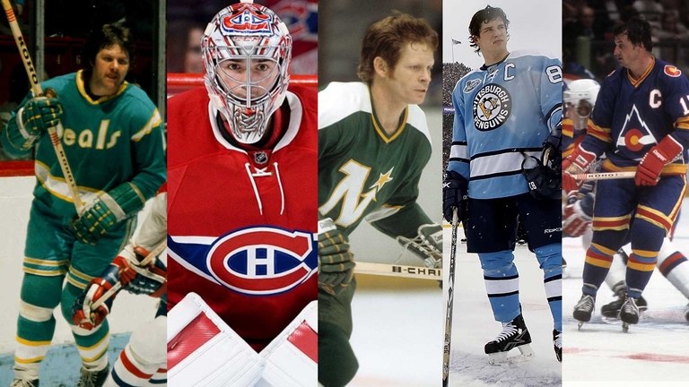
The aesthetic value of a hockey jersey is in the eye of the beholder, or so goes the diplomatic position. A logo some use as a dartboard is the very one others wish to be cloaked in when lowered into their final (pine) penalty box. The point is, art is subjective, and no one can reasonably say one piece of cloth is worthier than the other.
To that we say . . . no way! In fact, some hockey jerseys are better than others, and as the Loop's resident hockey expert (i.e. the only guy here who owns a pair of skates), I've chosen the start of another NHL season as an opportunity to reveal the best hockey jerseys of all time.
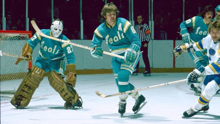
10. California Golden Seals (1970): This was teal before it was cool, and it was perhaps too ahead of its time, because the Golden Seals never made it past the disco era. The Charlie Finley-owned Seals also donned green and gold like Finley's other team, the Oakland A's, but it was these beauties that inspired equal parts awe and mockery.
 FacebookPinterest
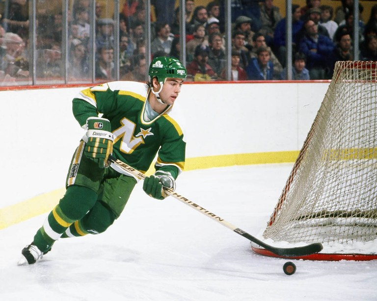
9. Minnesota North Stars (1980): You can probably already tell we have a soft spot for defunct franchises, and here we'd even argue these simple tri-color unis are preferable to the black-trimmed versions the team employed in its Stanley Cup Finals run in 1991. The North Stars moved to Dallas soon after, dropped the North from their nickname, and lost much of their charm as well.
 FacebookPinterest
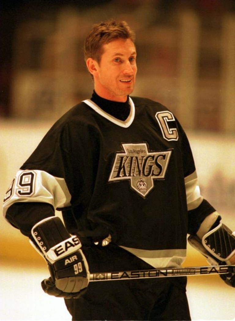
8. L.A. Kings (1988): It's funny, but when the Trade of the Century sent Wayne Gretzky to Hollywood, our initial reaction was Oh no! Those purple-and-yellow jerseys are hideous! What we didn't know was the Kings were in the midst of a sweeping makeover that included not only the best player who ever lived, but a silver-and-black motif that was cool enough for even the West Coast rap scene.
 FacebookPinterest
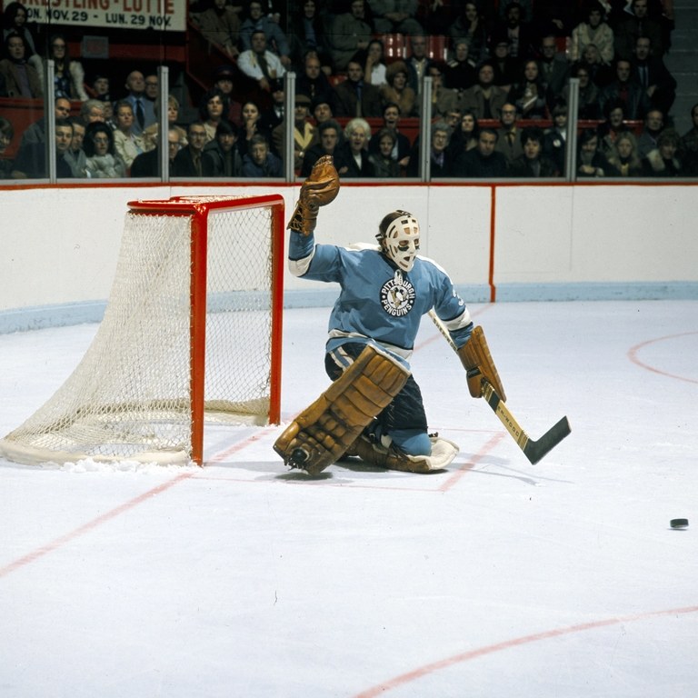
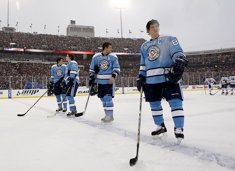
7. Pittsburgh Penguins (1968): These jerseys have had two incarnations, first donned by the expansion Pens in their second season . . .
 FacebookPinterest
. . . then reintroduced forty years later for the original Winter Classic in 2008, which Sidney Crosby famously won in a shootout. It's not lost on the NHL licensing department that the annual outdoor game has proven to be a gold mine for new jerseys. Speaking of which . . .
 FacebookPinterest
Related: Another year of Jaromir Jagr, the goofiest athlete ever
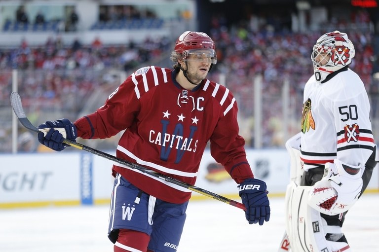
6. Washington Capitals (2015): The Capitals have had varying levels of success with logos through the years, because there are only so many ways to adequately represent your home in the nation's capital — flags, the actual Capitol building, a bald eagle. Look closely at this oversized "W" for the 2015 Winter Classic and you can see it's comprised of tiny Congressmen yelling at each other and not getting anything done.
 FacebookPinterest
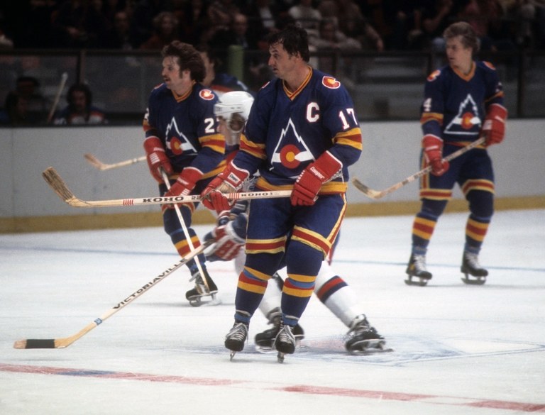
5. Colorado Rockies (1976): Once again we offer proof that a jersey has a better chance of making this list if the team is no longer in existence. But as these awesome duds can attest, if hockey couldn't make it in Denver in its first go-round, it wasn't because of the sweater.
 FacebookPinterest
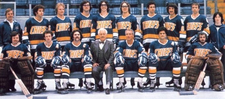
4. Charlestown Chiefs (1977): Technically not a real team, although based pretty faithfully on the Johnstown Jets of the old Eastern Hockey League. It's the valuable place the Chiefs occupy in hockey lore that makes this jersey such a classic. Donned by countless beer league teams around North America, the sweater is best worn with a healthy splotch of blood right above the logo.
 FacebookPinterest
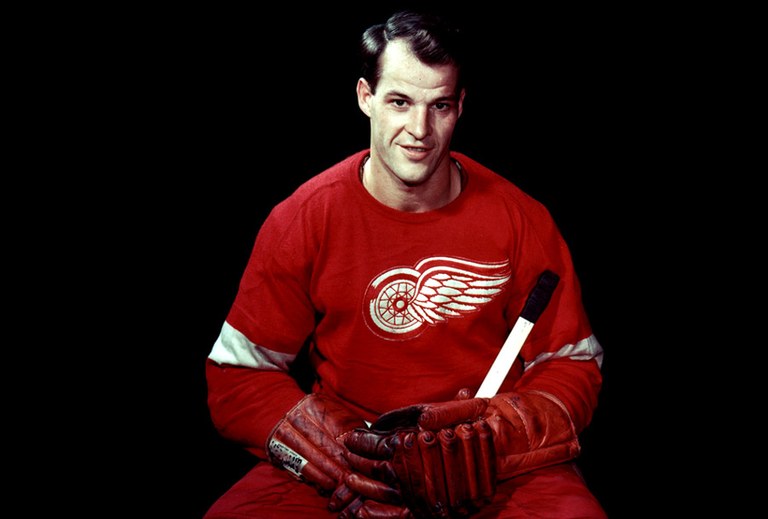
3. Detroit Red Wings: The competition is getting tougher as we get to the finish line, particularly with all of the Original Six franchises to consider (Spoiler alert: Someone's going to be pissed!). And that brings us to the Red Wings and the famed winged wheel signifying their Motor City home. We shudder to think of the number of people who identify this sweater not with 11 Stanley Cups, but with Cameron from "Ferris Bueller's Day Off" sulking his way through two hours draped in a Gordie Howe #9. Nonetheless, it was worthwhile exposure for one of the great athletes — and unis — in any sport.
 FacebookPinterest
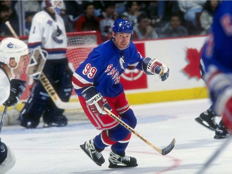
2. New York Rangers: The NHL has fluctuated throughout its history in its dress requirements for home teams. The most recent policy switch was in 2003, when it went back to the home team wearing colors and the visitors wearing white. At Madison Square Garden, this was a tectonic shift, because while the Rangers' white jersey is good, the blue is heavenly. Am I biased as a life-long Rangers fan? Of course. But if you think I'm wrong then you're clearly unbalanced and probably an Islanders fan.
 FacebookPinterest
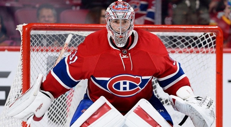
1. Montreal Canadiens: Alas, biases aside, nothing compares with the home red worn by "le Club de hockey Canadien" (again, the visiting white is comparatively weak). It's not just the history of 24 Stanley Cups, or the trail of Hall of Famers who've worn it, but the simple "C-H" logo outlined against the elegant blue and white stripes. True story, I used to spend a healthy percentage of 11th grade math designing a uniform for my high school hockey team that was a rip-off of that sweater. The jersey never came to fruition, and I think I got a D in the class. Still, it was time well spent.
 FacebookPinterest
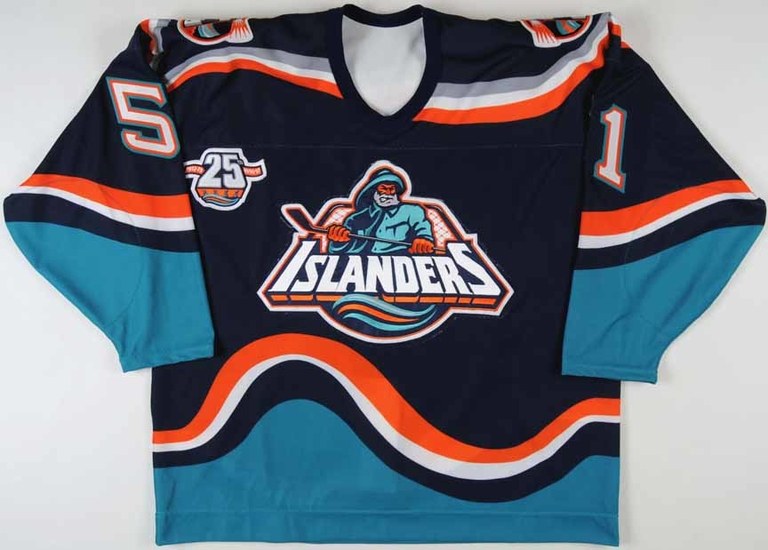
Honorable Mention: Toronto Maple Leafs, Hartford Whalers, Edmonton Oilers, New York Islanders mid-90s Fishsticks (just kidding, those are awful)
 FacebookPinterest
